Charles Monat website revamping

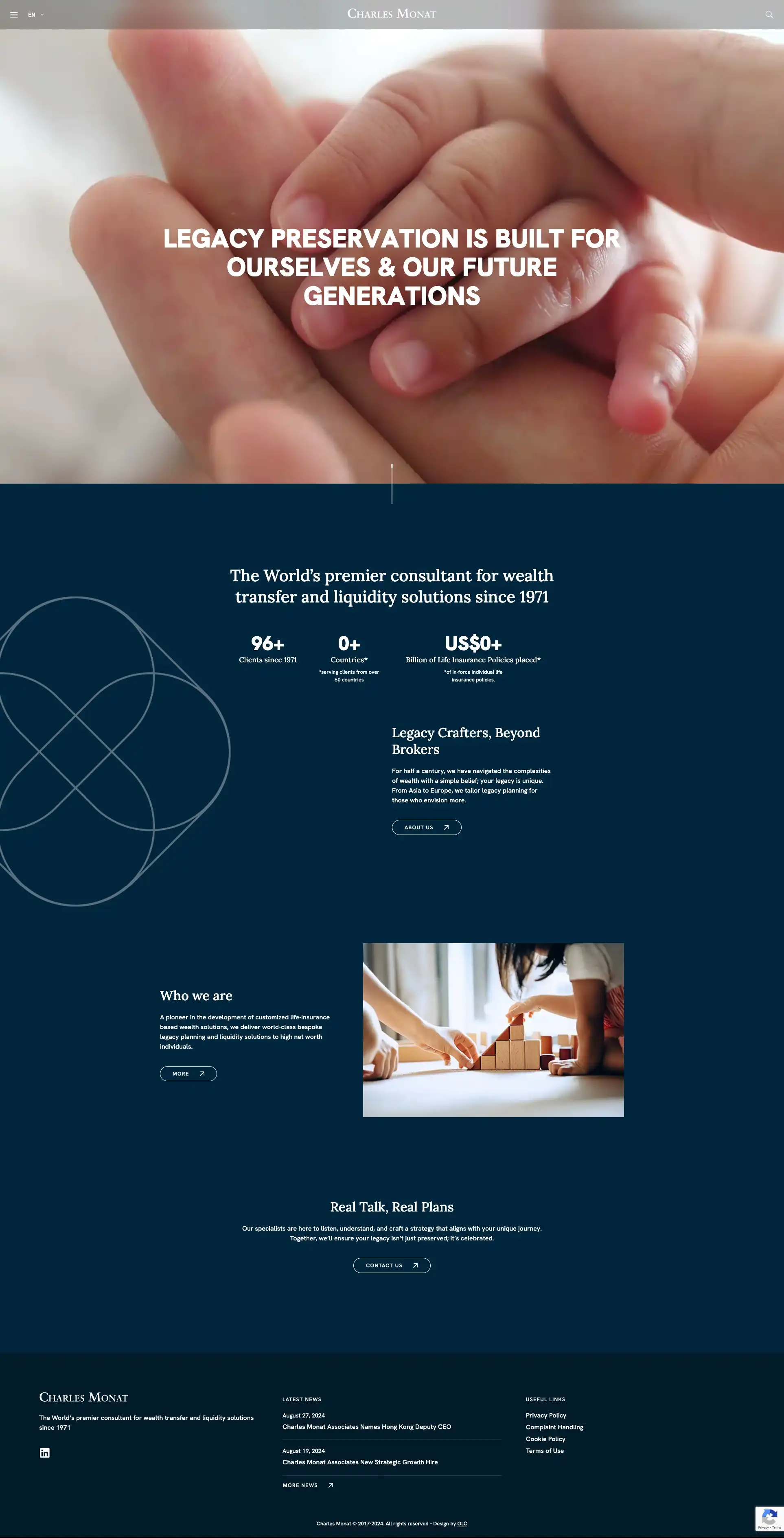
For the revamp of the Charles Monat website, we focused on a modern, clean design that emphasises clarity and user engagement. 

Before

After

View more
  • New, stunning contemporary images create an emotional connection with visitor making the brand more memorable and impactful.
  • We simplified navigation to enhance the user experience. 
  • Clearer content presentation with succinct and impactful statements  ensure the brand’s core message is delivered clearly.
  • By adding tangible facts, such as key figures on the homepage, we boost the brand’s credibility and authority.
  • Subtle animations introduce a dynamic and engaging experience adding a layer of sophistication without overwhelming the content.
 
Overall, the revamp creates a polished, professional, and memorable experience that aligns with the brand’s mission of wealth transfer and legacy planning.

We would like to thank the Monat team for their trust and collaborative spirit throughout the project.

Visit the website

Read more case study from our blog

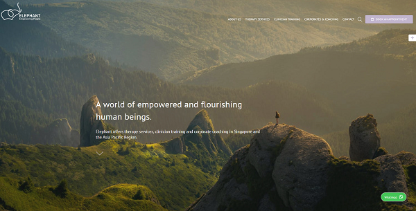
We tell you how we handled the revamp of this website, our challenges and solutions.
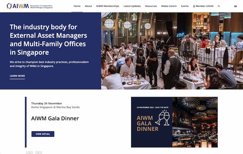
Another client story in which we tell you how we decided to tackle this super interesting project!
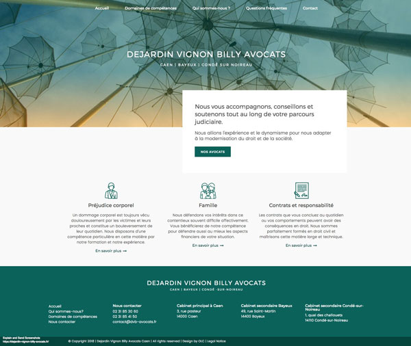
This project was a full rebranding and revamping for a law firm based in France.
The objective of this revamp was to turn their very old and minimalistic website into ...
The Singapore leading creative technology agency.
The objective of the revamp was to turn their very old, non-optimised, full of bugs website into a clean professional sleek website.
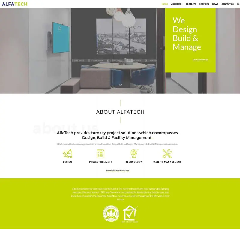
One of the 2018 revamping projects. The objective was to turn a very old, confusing website into a brand new modern one. The kind of project we love!
We completed the revamping of this website in 2019.
All articles loaded
No more articles to load